Uniform musings, Part 4 - New Uniforms in '07
Originally a DCP forum post, I thought this warranted its own entry. From the Annapolis show - After seeing the corps as a whole wearing the new unis., I present my best an worst of the new looks.
Best new uniforms - Cadets -
A return to the traditional look. Cummerbund now rides over the jacket again and dominates the look more than in the past four years. The jacket now appears even shorter, making the legs appear very long and tall. Gauntlets are gone (thank god) and the accents are back. FJM unis oversimplified the detail that gave the Cadets their unique uniform flavor. These new ones capture the original 80s look very well while updating certain aspects (better material for summer).
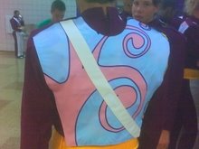
Worst new uniforms - Spirit
These unis are all over the place. The busy front and the weird light colored/blue/white front piece cuts across the jacket in a strange way. I it looks like someone didn't use colorsafe bleach and the dark blue bled all over the nice white shoulder piece. The horizontal white lines on the other half of the jacket dont do anything for them. There is no definition to the new look making their already sloppy drill look even worse. In bright sunlight, they may look slightly better, however nighttime is not their friend.
Worst uniform change - Bluecoats
two-tone blue??? honestly?? I did kind of get used to it by the end of the show, however from the uniforms they came from, this has to be the worst move in all of DCI. Their previous uniforms were so clean cut and nice to look at, with the white and blue. The white made a nice clean contrast with the field and made their marching look clean and clear. The black pants feel like a cop-out, an easy way to hide dirty feet instead of working to improve fundamentals. The black and two tones of blue make them too dark on the field...and there is really no need for it. They look like BD or Blue knights now...not really a good thing.
Best uniform change - Glassmen
The addition of the gold chain adds a little variety and reflective flare into a very "blah" uniform. Before the uniform looked very uninteresting and bland, especially with that flimsy reflective triangle on the right shoulder. The chain falls asymmetrically over the black abyss that is the lower 4/5ths of the uniform and breaks it up nicely. in addition they now make a nice "clank" sound when they move their horns down to "parade rest"
Most unnecessary uniform change - Crown
I really like the cream and purple...might be a bit of overkill to cash in the purple for the gold. Gold and cream are too similar in tone to really contrast at all. The brown plumes are a nice touch (for the horse show). The most unnecessary part of the uniform is the tassel that hangs down from the front of the jacket just above the crotch. WHat is THat thing?!?! It is nice to see a top 12 corps staying with white or cream colored pants...shows they are not trying to hide anything about their marching technique.
__________________
I will have more uniform reviews as I see them this season.
Best new uniforms - Cadets -
A return to the traditional look. Cummerbund now rides over the jacket again and dominates the look more than in the past four years. The jacket now appears even shorter, making the legs appear very long and tall. Gauntlets are gone (thank god) and the accents are back. FJM unis oversimplified the detail that gave the Cadets their unique uniform flavor. These new ones capture the original 80s look very well while updating certain aspects (better material for summer).
Worst new uniforms - Spirit
These unis are all over the place. The busy front and the weird light colored/blue/white front piece cuts across the jacket in a strange way. I it looks like someone didn't use colorsafe bleach and the dark blue bled all over the nice white shoulder piece. The horizontal white lines on the other half of the jacket dont do anything for them. There is no definition to the new look making their already sloppy drill look even worse. In bright sunlight, they may look slightly better, however nighttime is not their friend.
Worst uniform change - Bluecoats

two-tone blue??? honestly?? I did kind of get used to it by the end of the show, however from the uniforms they came from, this has to be the worst move in all of DCI. Their previous uniforms were so clean cut and nice to look at, with the white and blue. The white made a nice clean contrast with the field and made their marching look clean and clear. The black pants feel like a cop-out, an easy way to hide dirty feet instead of working to improve fundamentals. The black and two tones of blue make them too dark on the field...and there is really no need for it. They look like BD or Blue knights now...not really a good thing.
Best uniform change - Glassmen
The addition of the gold chain adds a little variety and reflective flare into a very "blah" uniform. Before the uniform looked very uninteresting and bland, especially with that flimsy reflective triangle on the right shoulder. The chain falls asymmetrically over the black abyss that is the lower 4/5ths of the uniform and breaks it up nicely. in addition they now make a nice "clank" sound when they move their horns down to "parade rest"
Most unnecessary uniform change - Crown
I really like the cream and purple...might be a bit of overkill to cash in the purple for the gold. Gold and cream are too similar in tone to really contrast at all. The brown plumes are a nice touch (for the horse show). The most unnecessary part of the uniform is the tassel that hangs down from the front of the jacket just above the crotch. WHat is THat thing?!?! It is nice to see a top 12 corps staying with white or cream colored pants...shows they are not trying to hide anything about their marching technique.
__________________
I will have more uniform reviews as I see them this season.
Continue reading...