Showing posts with label visual. Show all posts

Friday, July 20, 2007

Uniform musings, Part 6 - New Uniforms in '07, Allentown edition

So, I have been a little late in getting this out due to some other factors, but without further ado, here are some thoughts on the new uniforms I saw in Allentown.


Best "Surprisingly good" uniforms - Madison
I did not initially think this was a good change for Madison who did have beautiful white pants and a cool jacket design, however after seeing them in person, I found my opinions to be quite different. Marching was never Madison's strong point, so green pants does a lot to refocus the eye onto the white gauntlets, hat, and shoulders. The three-tone green effect was not as offensive as the Bluecoats two-tone blue mainly because the greens turn into a visual "wash" against the variable green field background. The simplified jacket removes the awkward business of the "half-fleur" and makes for a cleaner look all around.

The "To boldy go..." award - SouthwindThe "inspired by Star Trek" look works well for Southwind who has not had th best luck in uniform selection over the past couple years. The return to the traditional shako and plume is a safe choice and the simplified colors and cut to the uniforms make the corps look more cohesive as a unit. There is some visual distinctiveness as it is very apparent when parts of the corps are turned backfield. The yellow and white on the shoulders serves well to highlight front facing performers.


Continue reading...

Wednesday, June 13, 2007

Uniform musings, Part 3 - The Blue Devils

The Blue Devils (Concord, CA)
The uniforms of the Blue Devils, like most other drum corps, arose out of the military tradition - this instance the corps arose from a VFW post in Concord. The early uniforms were keeping in this military style complete with cummerbund, shakos, and cross-belts. Over time those elements have not disappeared completely, they have just evolved into the current design we know BD for today. The cummerbund and cross-belt have been melded together to form a sharp reflective, sequined angle that cuts both ways across the chest. The shako is black with silver highlights.

The Blue Devils uniform works in different ways than either The Cadets or The Cavaliers. Where those corps uniforms rely on a contrast of color to highlight the performers (white/cream against a green field), The Blue Devils rely on a contrast of illumination. Allow me to explain. The sequins and silver reflects the light back in a more true fashion than the solid bold white of the other corps. This gives a greater illuminative effect at night and in low light, or directional light situations (for example stadium lights). It is the difference between standing out in a field at night holding a white piece of paper verses a sheet of aluminum foil. The silver compliments the silver of the horns forming more of an active contrast where the reflected light is engaging you in different ways depending on your angle. This concept flows nicely with the laid-back, easy-going reputation of the corps.

The lower half of the body is shrouded in darkness, like the Cavaliers, obscuring any clear read on the technique. Personally, I am not sure exactly how they teach it, but from being around the activity and talking to people, it seems as though they do everything in the easiest way possible that still looks good. The marching technique is definitely not a "bicycle" like the Cavaliers, however it isn't a strict straight-legged technique either. The black pants allow them to
become more relaxed and take a more natural approach to marching.


Thats it for BD, I probably missed something, so drop me a line and let me know.


Continue reading...

Uniform musings, Part 2 - The Cavaliers

The Cavaliers (Rosemont, Ill.)
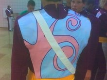
The Cavaliers white collared green top and black pants provide a stark counterpoint to the Cadet's "West Point" uniforms. As different as the uniforms are now, The Cavaliers original uniforms have a similar design legacy to the Cadets. The original uniforms were khaki affairs complete with shoulder braids reminiscent of military stylings. New uniforms were purchased from Army surplus stores in blue of all colors, then the following year, new uniforms yet again. These uniforms resembled more the style associate with the Cavaliers today, save for the shako and cummerbund. The "Cavalier" hat was first worn by the corps in 1976. The shape and height of the crown of the hat is different from an Aussie.Variations of the '76 uniform were worn through 1983. The first edition of the current uniform was worn in 1984. (thanks j_paul!) These uniforms assist the Cavaliers in executing a completely different visual style than The Cadets.

The short jacket and absence of a cummerbund obscure a good portion of the performers' figure beneath a shroud of dark material. This brings the viewer's focus to the top third of the body. The uniforms are designed just the opposite of the Cadets' - not only is the focus entirely on the upper body, but the white "wing" elements on the shoulder serve to broaden the upper body, building a strong horizontal presence. The sash is even curved a bit in a downward sweep, minimizing any height drop. The entire Cavalier visual program is based around this premise of horizontal over vertical. When horns are in playing position, the imposing nature of their posture arises, not from height, but from this broad encompassing stature.

The lower body being shrouded in a vague, dark mass makes it easy for the Cavaliers to pull off their signature "Bicycle" marching style. The style involves significant leg motion and knee bend to achieve. Since the uniform is not dependent upon a stature of height, the drastic height changes associated with this style of marching become less noticeable and less offensive to the eye. Timing and spacing errors also become less obvious due to less contrast between the black pants and the green field. The use of this style of marching makes possible many swift moves that would prove to be almost prohibitively challenging to the straight legged corps.

The upper body is clearly contrasted through the use of a white collar, white "wings", a white sash, white gauntlets and white gloves. These aspects of the uniform are seen to move smoothly across the field - to "float" if you will. It is these elements that make up the forms of the drill. The audience doesn't see a tall thin figure (as with the uniforms of The Cadets), but instead, a figure almost wider than it is in height. It is almost as if there are little white rectangles (or more accurately, triangles) moving around the field at a very quick pace, forming pictures and developing forms.

The Cavaliers visual staff makes full use of this visual aspect of the uniforms. More often than not, visuals involve the upper body creating motion. This is most clearly seen in "Machine" near the beginning when the trumpets move into two huge vertical lines . The visual is one where the upper body is tilted to the left and right, alternating every other person (sorry, I cant find my video or I would give you a time marker). This works only due to the uniforms and the visual spectacle they create.

Thats all for right now...tomorrow, The uniforms of the Blue Devils


Continue reading...

Tuesday, June 12, 2007

Musings on Band and Corps Uniforms in Visual design...

Well for my first installment of what I hope to be many postings, I am focusing in on something that I have been thinking about for some time. Uniforms are the most basic, recognizable aspect of a corps - even defining part of their heritage or tradition. Sometimes there uniforms even affect the development of a corps visual and marching styles. Often, this most basic part of a corps identity is overlooked with regards to the visual aspect of the performance. The guard is what we think of mostly as defining the visual design of the show, but what we don't always realize is how much this is affected by the type and style of the uniforms of the corps. I will start out looking at different uniforms and showing how they define the visual characteristics of the corps. Then I will turn my attention to the future of uniforms in the marching activity.

The Cadets (Allentown, PA)
The "West-point" style maroon and cream uniforms date back to the oldest incarnations of the corps. This design (with the notable exceptions of 2005 and 2006) has remained largely intact throughout the years. It has become an icon for the oldest corps in America and is a symbol of pride for those who wear it. The picture is somewhat dated as it depicts the uniforms worn from 2003-2006. The current uniforms have slight changes in the detailing.

Visually, the most striking parts of the uniform are the cream colored pants with the maroon stripe running down the side and the reflective buckle on the cross-belt. The uniform is designed to enhance the height of the performer, mainly through the long light colored pants, the short jacket, and the high yellow cummerbund. An interesting tidbit is the shrinking drop sash over the years. Back in the 60s and 70s, the sash came down to about the knees of the performer. This had the effect of shortening the performer visually. The sashes of the 80s shrunk a bit, coming to around the mid-thigh region. Gradually over the years it has been shortened to its current length, ending around the "crotchal" region. The elongated vertical line created by the uniform is accented by the classic plume that emerges straight from the top of the shako.

Anyone who knows the Cadets know they are famous for their straight-legged marching style. The uniform accentuates this style by drawing the eye to the cream colored pants with the maroon stripe. Theoretically the maroon stripe is never supposed to be broken while marching. Watching the Cadets perform, it is clear the visual impact the technique and uniform create. The drill focuses mostly on form development such as pass throughs and evolving amorphous forms that serve to bring out the movement of the lower body. Rarely will one see an effective upper-body movement with the cadets (I'm thinking of the terrible ones added into the 2003 show as an example) because there is no striking visual impact to be had from the upper body movements.

Due to the focus on the lower body, timing is extremely important for this corps. Lagging visual scores have been almost a signature for the corps in recent years as the cream pants do not forgive even the slightest timing errors. Spacing errors are also highlighted by the tall vertical cream pillars seen on the field.

That's all for tonight, more tomorrow! - Next post - the Uniforms of the Cavaliers!

; ;


Continue reading...